
India Royale
Luxury Cosmetics fit for the Queen in you.
In a world saturated with cosmetic brands, the creative direction chosen for this brief seeks to differentiate the brand through vibrant colours and iconography that honours its heritage. This is showcased in the visuals inspired by the stunning architecture and symbolism found all across India. The focus on shades of red with subtle pops of pink and gold were selected to convey the passion behind the brand and the feminine, elegance of the brand's creator. 

Logo Lock-Up and Icon of India Royale brand. The icon (left) inspired by Indian architecture representing a doorway to a world of luxury cosmetics. "India Royale" in a classy san serif font with a stylised "R", indicating opulence and "that little something extra".

Logo Options for India Royale.
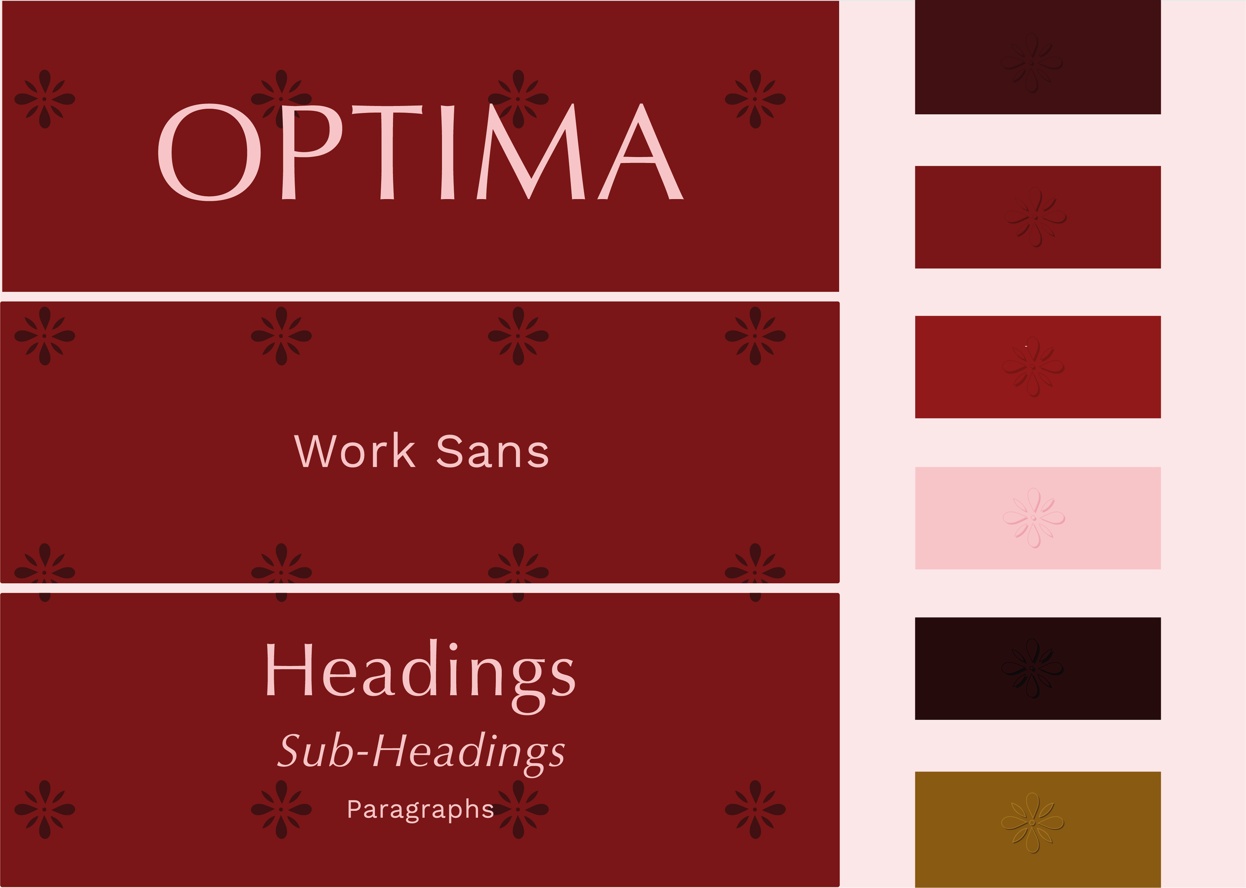
Optima and Work Sans are the main fonts for India Royale. Optima for its elegance and Work Sans for its simplicity and warm rounded appearance. Red and red tones make up the majority of the brand colour palette, conveying passion and luxury, further emphasised with pink and gold used accent tones.

Brand Pattern using the the India Royale flower symbol
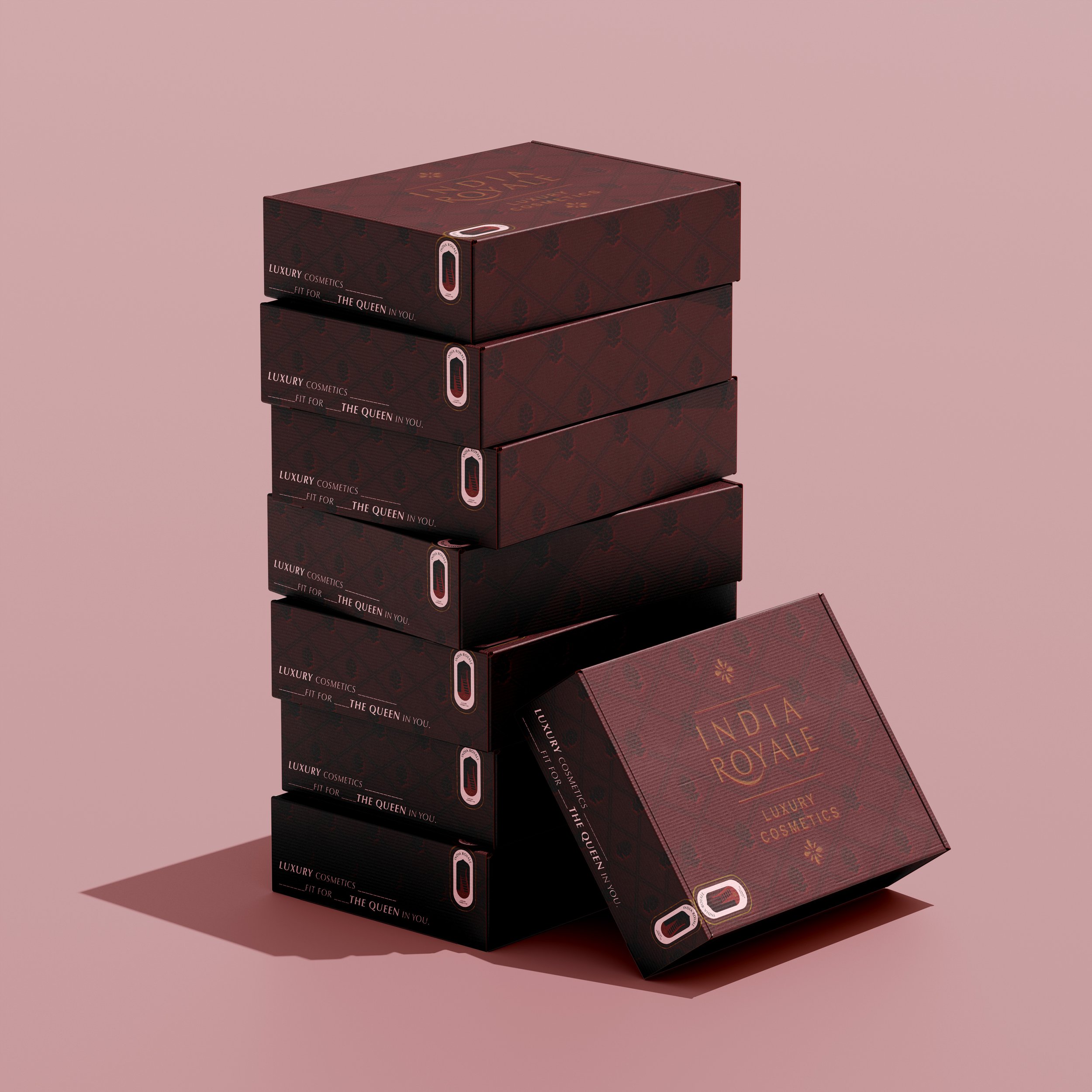
Mailer Box Design - designed to cause minimal impact on the environment and providing a delightful and upscale unpacking experience.

Mock-up for a Face Primer and Matte Lipstick. Differentiation between skincare and make-up shown through use of brand colours and logo lock-ups. Burgundy and Off-White text with lock-up 01. used for skincare to convey simple luxury - clean ingredients. Deep Red with lock-up 02. with gold colouring to convey indulgent luxury of the make-up range - the jewel of the brand.

Eyeshadow Palette mock-up, which embossing and lock-up 03. in gold to convey indulgent luxury.
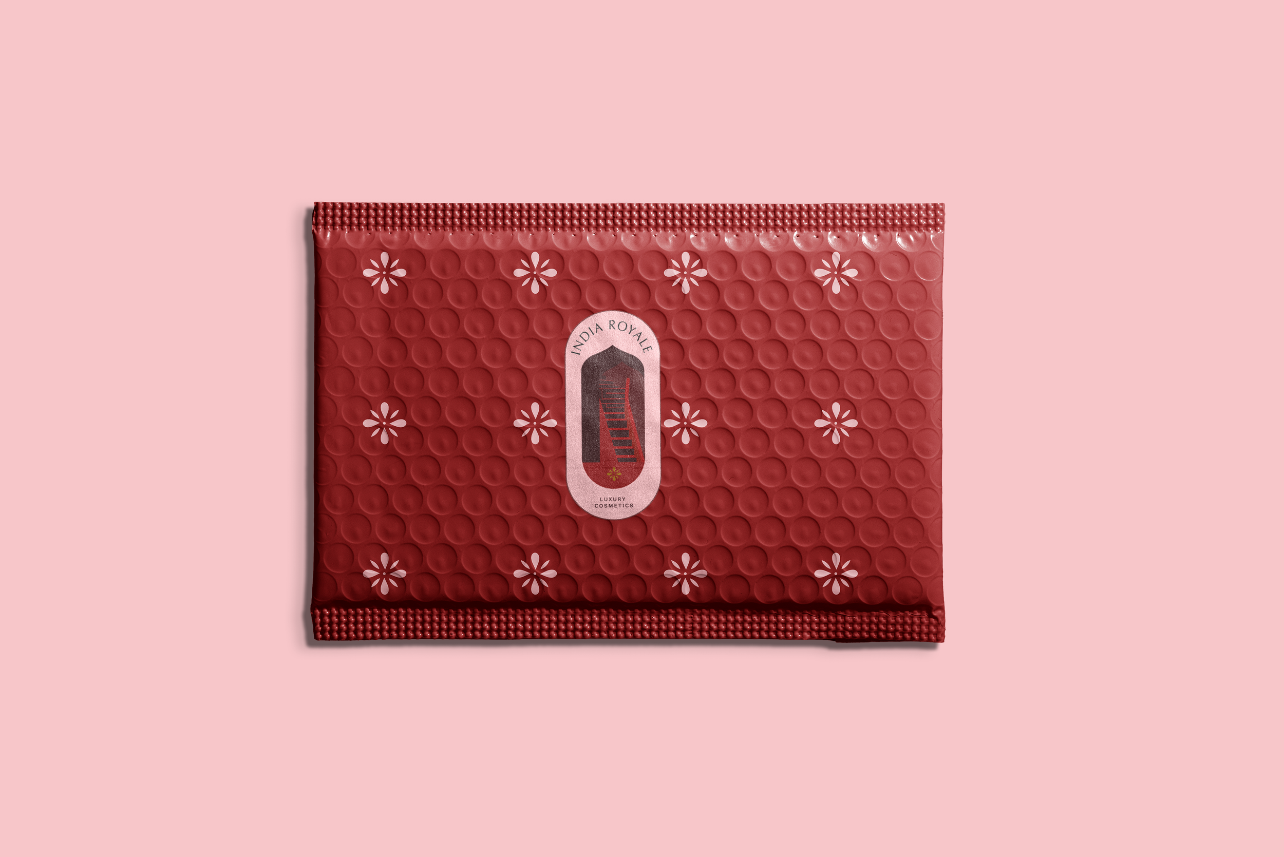
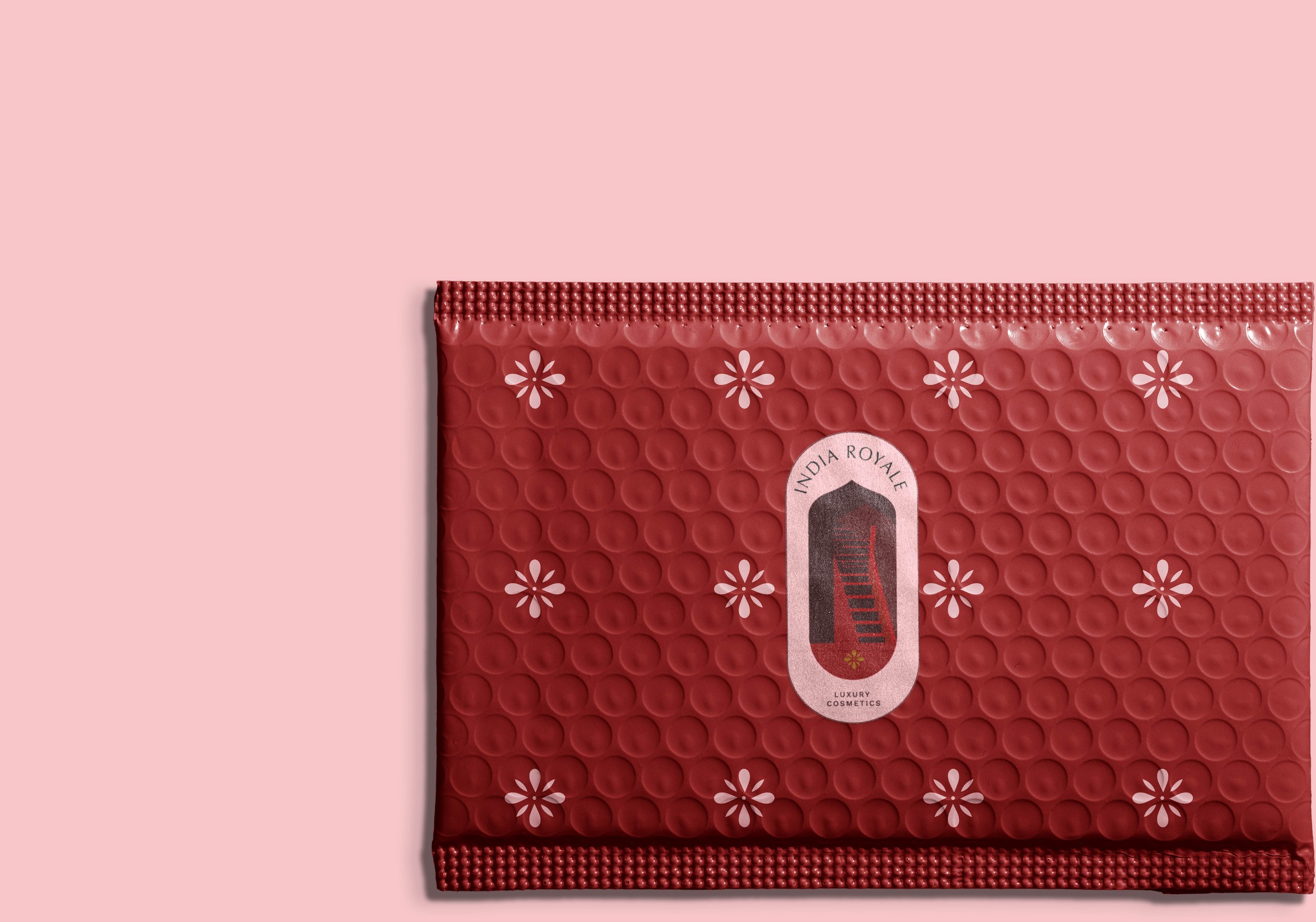
Bubble Mailer utilising brand patten and lock-up 02. as a sticker.